
In the competitive landscape of modern marketing, a compelling call-to-action (CTA) is crucial for converting prospects into customers. A CTA is more than just a button or a link; it’s a strategic element that guides your audience towards the desired action, whether it’s making a purchase, signing up for a newsletter, or downloading a resource. Crafting a great call-to-action requires careful consideration of several factors, including compelling language, strategic placement, and a clear understanding of your target audience. This article will delve into the essential elements that make a call-to-action truly effective, ultimately boosting your marketing campaign’s success.
Understanding what makes a great call-to-action can significantly impact your conversion rates. A well-crafted CTA leverages persuasive language, creating a sense of urgency and value for the user. It should be visually appealing, prominently placed, and easily accessible across various devices. From the wording and design to its placement and overall relevance to the user experience, optimizing your call-to-action is a key step in creating a successful marketing strategy. By implementing the principles discussed in this article, you can transform your CTAs from passive suggestions into powerful drivers of engagement and conversions.
The Psychology Behind CTAs
Effective CTAs leverage psychological principles to influence user behavior. Understanding these principles is crucial for creating high-converting calls to action.
One key principle is the principle of scarcity. Limited-time offers or limited availability create a sense of urgency, encouraging users to act quickly. Phrases like “limited-time offer” or “while supplies last” tap into this principle.
Another important principle is social proof. People are more likely to take action if they see others doing the same. Testimonials, reviews, and social share counts can provide this social proof.
Clarity is also essential. A CTA should clearly communicate the desired action and the benefit of taking that action. Use strong verbs and make it clear what the user will gain.
Words That Trigger Action
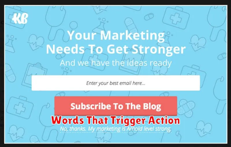
Specific words in your call-to-action (CTA) can significantly impact its effectiveness. Choosing the right words can be the difference between a click and dismissal. Think of these words as triggers, prompting immediate action from your audience.
Action verbs are crucial. Words like “Get,” “Download,” “Shop,” “Start,” “Learn,” and “Join” create a sense of urgency and direct users toward the desired action. These words clearly communicate what you want the visitor to do.
Words that imply value and benefit are also highly effective. “Free,” “Exclusive,” “Limited-Time,” and “Save” can entice users to take advantage of a perceived opportunity. Highlighting the value proposition strengthens the CTA.
Creating a sense of urgency can also boost conversions. Using words like “Now,” “Today,” or referencing a specific deadline encourages immediate action. This limits procrastination and drives engagement.
Designing High-Converting Buttons
Button design plays a crucial role in conversion rates. A well-designed button attracts attention and encourages clicks, leading to desired actions.
Size and Shape: Buttons should be large enough to be easily tapped on mobile devices and visually prominent on larger screens. Experiment with shapes, but avoid anything too unconventional that might confuse users. Rectangular buttons are generally a safe and effective choice.
Color and Contrast: Use colors that stand out against the background and align with your brand. High contrast is key for visibility. A/B test different color combinations to determine what resonates best with your audience.
Microcopy: The text within the button, known as microcopy, should be action-oriented and clearly communicate the benefit of clicking. Use strong verbs and concise phrasing, such as “Get Started,” “Download Now,” or “Learn More.”
Whitespace: Sufficient whitespace around the button helps it stand out and prevents it from feeling cluttered. This improves visual clarity and makes the button more inviting.
Testing CTA Placement

Call-to-action (CTA) placement significantly impacts its effectiveness. Testing different locations is crucial for maximizing conversions. A poorly placed CTA can easily be overlooked, while a strategically placed CTA can guide the user towards the desired action.
Consider testing CTAs above the fold, ensuring immediate visibility upon page load. Also, experiment with placing CTAs within the content itself, strategically positioned after presenting compelling information. Don’t neglect the power of CTAs at the end of the content, providing a clear next step after the user has consumed the information.
A/B testing is a valuable tool for determining optimal CTA placement. By creating variations with different CTA locations, you can analyze click-through rates and conversion data to identify the most effective placement for your target audience.
Mobile Optimization for CTAs
Given that a significant portion of web traffic originates from mobile devices, optimizing your calls-to-action (CTAs) for mobile users is essential. Mobile optimization isn’t simply about shrinking the size of your website; it’s about creating a seamless and intuitive user experience.
Consider the following factors when optimizing CTAs for mobile:
- Button Size and Placement: Ensure CTA buttons are large enough to be easily tapped with a finger and positioned prominently on the screen. Avoid placing them in areas that are difficult to reach with one hand.
- Concise Language: Use clear, concise language. Mobile users often have shorter attention spans, so get straight to the point.
- Mobile-Friendly Forms: Simplify forms as much as possible. Minimize the number of fields and utilize features like autofill to streamline the process.
- Page Load Speed: A slow-loading page can lead to user frustration and abandonment. Optimize images and other elements to ensure fast load times.
By prioritizing these elements, you create a positive user experience and increase the likelihood of conversions on mobile devices.
CTA Examples by Industry
E-commerce: Common CTAs focus on adding items to carts and completing purchases. Examples include “Add to Cart,” “Shop Now,” “Buy Now,” and “Check Out.”
SaaS (Software as a Service): CTAs often encourage trials or demos. Think “Start Free Trial,” “Request a Demo,” “Get Started,” or “Learn More.”
Real Estate: CTAs center around property viewing and contact. Examples are “Schedule a Showing,” “View Listing,” “Contact Agent,” and “Get Pre-Approved.”
Travel and Hospitality: These CTAs often involve booking or exploring options. “Book Now,” “Find a Flight,” “Explore Destinations,” and “View Deals” are frequently used.
Non-profit: CTAs focus on donations and engagement. “Donate Now,” “Volunteer,” “Learn More,” and “Sign the Petition” are common examples.