
Are you struggling to improve your website conversions? Do you want to understand how users interact with your site and identify areas for improvement? Heatmaps are a powerful tool that can provide valuable insights into user behavior, allowing you to optimize your website for better conversions. This comprehensive guide will teach you how to use heatmaps effectively to increase your website conversions. We’ll cover everything from understanding different types of heatmaps to interpreting the data and implementing changes based on your findings. Learning how to use heatmaps can be the key to unlocking higher conversion rates and achieving your business goals.
By visualizing user behavior, heatmaps can reveal where users click, scroll, and move their mouse, providing a clear picture of what’s working and what’s not. Understanding these patterns can help you make data-driven decisions to optimize your website’s design, content, and calls to action. Whether you’re an experienced marketer or just starting out, this guide will equip you with the knowledge and skills needed to leverage heatmaps for website conversion optimization. Discover the power of heatmaps and unlock the potential of your website.
What Are Heatmaps
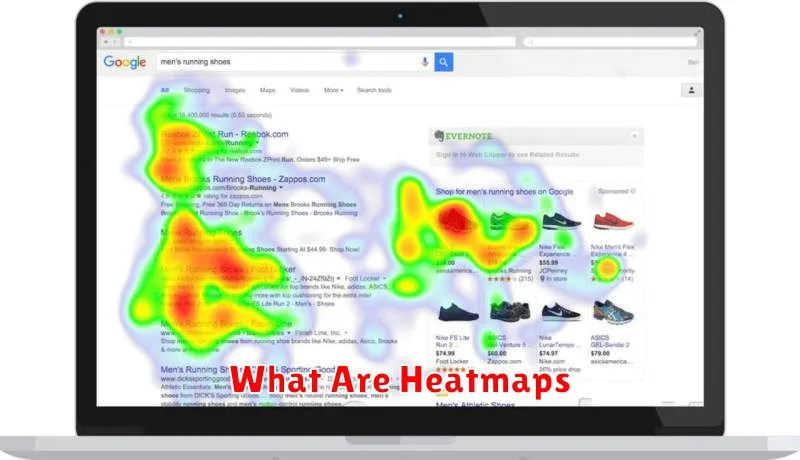
Heatmaps are visual representations of user interaction on a webpage. They use a color-coding system, typically ranging from cool tones (blue or green) for low activity to warm tones (red or orange) for high activity, to display where users are clicking, scrolling, and moving their mouse.
Essentially, heatmaps provide a graphical overview of user behavior, allowing you to quickly and easily understand which areas of your website are attracting the most attention and which areas are being ignored.
Several types of heatmaps exist, each focusing on a different aspect of user interaction:
- Clickmaps: Track where users click on a page.
- Scrollmaps: Show how far down a page users scroll.
- Mouse-tracking heatmaps (Movemaps): Visualize mouse movements, providing insights into where users’ attention is directed, even if they don’t click.
Popular Heatmap Tools
Several tools are available to generate heatmaps, each offering different features and pricing. Selecting the right tool depends on your specific needs and budget. Some popular options include:
Mouse Tracking Heatmap Tools
These tools track mouse movements, clicks, and scrolls to visualize user interactions. Hotjar, Mouseflow, and Crazy Egg are prominent examples, offering features like session recordings and form analytics in addition to heatmaps.
Eye-Tracking Heatmap Tools
While less common due to higher costs, eye-tracking tools provide valuable insights into where users are visually focusing. They typically involve specialized hardware and software. Tobii Pro and EyeSee are examples of providers in this category.
Open-Source Heatmap Tools
For those seeking a cost-effective solution, open-source options like heatmap.js offer basic heatmap functionality. However, they often require more technical expertise to implement and may lack the advanced features of commercial tools.
Tracking Scroll and Click Behavior
Heatmaps provide valuable insights into user scrolling and clicking behavior. Scroll maps visualize how far down the page users scroll, identifying areas where content may be losing their attention. A high drop-off rate before reaching key content or calls to action suggests a need for improvement in engagement or content placement.
Click maps, on the other hand, highlight the elements users interact with most. By analyzing click distribution on interactive elements like buttons, menus, and links, you can identify areas of high engagement and areas that are being overlooked. This data can inform design changes to improve click-through rates and guide users towards desired actions.
Analyzing both scroll and click maps together provides a comprehensive understanding of user behavior. For example, if users are scrolling past a crucial call to action without clicking, it may indicate a design flaw or confusing placement.
Interpreting Heatmap Data
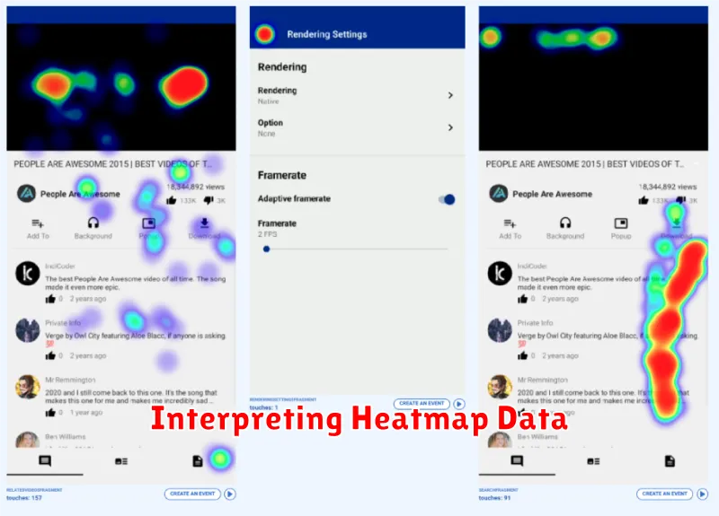
Interpreting heatmap data effectively is crucial for extracting actionable insights. Heatmaps visually represent user interaction on your website through color variations. Warm colors, such as red and orange, typically indicate high activity areas, while cool colors, like blue and green, represent areas with less user engagement.
Analyzing these patterns allows you to understand user behavior. For example, a high concentration of red on a specific call-to-action button suggests it effectively attracts clicks. Conversely, a cold patch over a crucial section of content may signal that it’s being overlooked.
Consider the different types of heatmaps to gain a comprehensive understanding. Clickmaps track where users click, scrollmaps visualize scrolling depth, and movemaps show mouse movement patterns. Each provides unique insights into user behavior.
By interpreting these visualizations in context with your website’s goals, you can identify areas for improvement and optimize for better conversions.
Improving UX Based on Data
Heatmaps provide valuable visual data about user behavior on your website. This data goes beyond traditional metrics like bounce rate and time on page, offering a granular understanding of how users interact with specific elements.
Analyzing heatmap data allows you to identify friction points in the user experience. For example, a cold area around a call-to-action button might indicate it’s not prominent enough. Conversely, high activity in an unexpected area could reveal usability issues or confusing navigation.
By understanding these patterns, you can make data-driven decisions to improve your website’s UX. This might involve repositioning key elements, simplifying navigation, or clarifying calls to action. The goal is to optimize the user journey and ultimately increase conversions.
Before-and-After Conversion Rates
Tracking the impact of changes made based on heatmap analysis is crucial. This involves comparing conversion rates before and after implementing changes.
Before implementation, establish a baseline conversion rate. This serves as your benchmark for measuring improvement. Collect data over a significant period to account for natural fluctuations.
After implementing changes, monitor conversion rates closely. Give enough time for the changes to have a measurable effect. Compare the new conversion rate with your baseline. A positive change demonstrates the effectiveness of your optimization efforts.
Presenting data in a clear and concise manner helps visualize the impact. Consider using a table like the example below:
| Metric | Before | After | Change |
|---|---|---|---|
| Conversion Rate | 2% | 3% | +50% |